In this lesson students will:
- Draw and interpret scatter diagrams
- Identify correlation (eg ‘strong negative’)
- Draw a line of best fit and use to predict values
- Predict correlation (including strength) from real-life examples when data not given (eg house price with distance from London)
KS3 Maths Curriculum Area
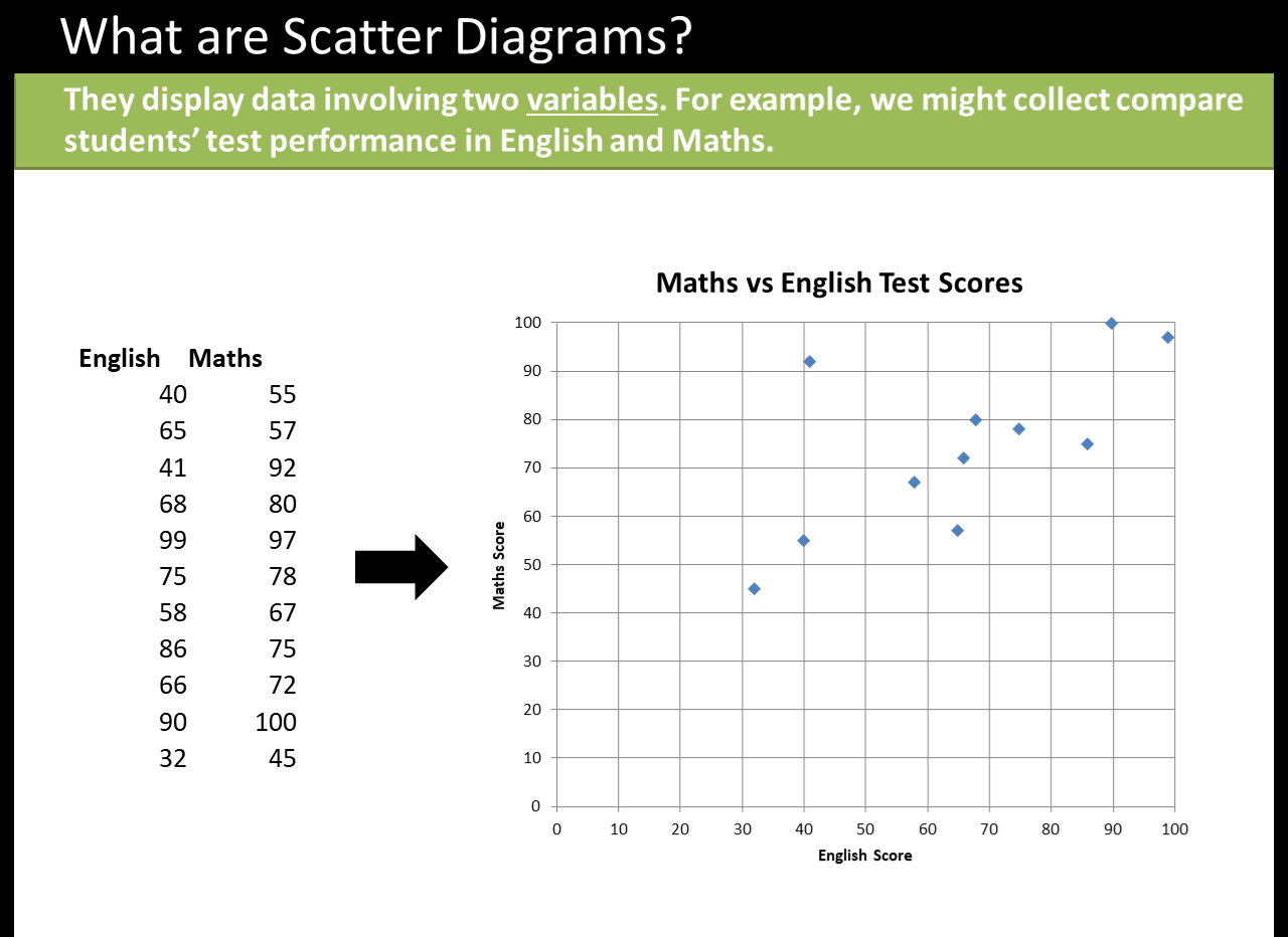
Statistics Describe simple mathematical relationships between two variables (bivariate data) in observational and experimental contexts and illustrate using scatter graphs.
 Dr Frost is a maths teacher working at Tiffin School in London. You can find all of his resources at his website drfrostmaths.com, a huge bank of PowerPoints, worksheets and activities spanning Year 7 to Further Maths.
DOWNLOAD A FREE RESOURCE!
Scatter Diagrams for KS3 Maths